 Location Taken: Washington DC
Time Taken: October 2008
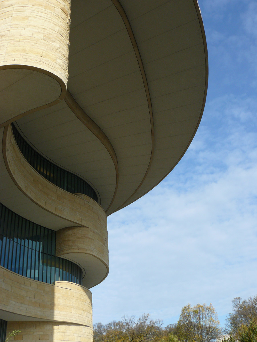
To continue off of the picture from yesterday, this one was only taken a few minutes later, when I had reached my destination. You can see this building in the picture from yesterday. That’s the back of it, this is the front.
As for what it is, it is the National Museum of the American Indian. It’s one of the newest museums on the National Mall, having only opened in 2004. I was doing a temporary job down in Alexandria, VA in the fall of 2008, and one day, instead of just taking the train home as usual, I took it to the station near the National Mall and walked to this museum. I had never visited it, after all, and was curious.
Somehow, I both rather like and rather dislike this museum, all at once.
On the like side, it does a very good job with its exhibits, being full of history and quite balanced between all aspects of Native American history, it’s very aesthetically interesting, with a large open area by the entrance for events, with balconies looking over for people to watch, and there’s a fabulous show that you should catch if you visit (assuming they haven’t changed it out). They have a special round video room where they can project both on the ceiling and on the four screens arrayed around a “rock” in the center (which is also a screen of sorts). The viewers sit on seats around the edges of the room, and they use all those screens very well, creating a marvelously immersive experience. I don’t really remember the video that well, but I remember the room quite well.
On the dislike side, the place felt, well, empty. There were exhibits a plenty, and a fairly typical crowd for a museum on a workday evening (fairly sparse, but not overly so), but still, there was something empty about it. The exhibits were almost all fully enclosed into their own rooms, with fairly plain hallways connecting them. This made them feel disparate, and tough to mentally connect with one another. The large open area, while making my artistic side happy with its curves and dome and oculus, was largely white, which made it feel untouchable and unwelcoming. The place needs color and connections, with one exhibit spilling into another so the museum goer can wander somewhat randomly from one interesting area to another, lost in the realm of knowledge.
Cheaper food in the cafeteria wouldn’t hurt, either. It was tasty and well-researched, pretty much all Native American recipes, but man was it overpriced.
