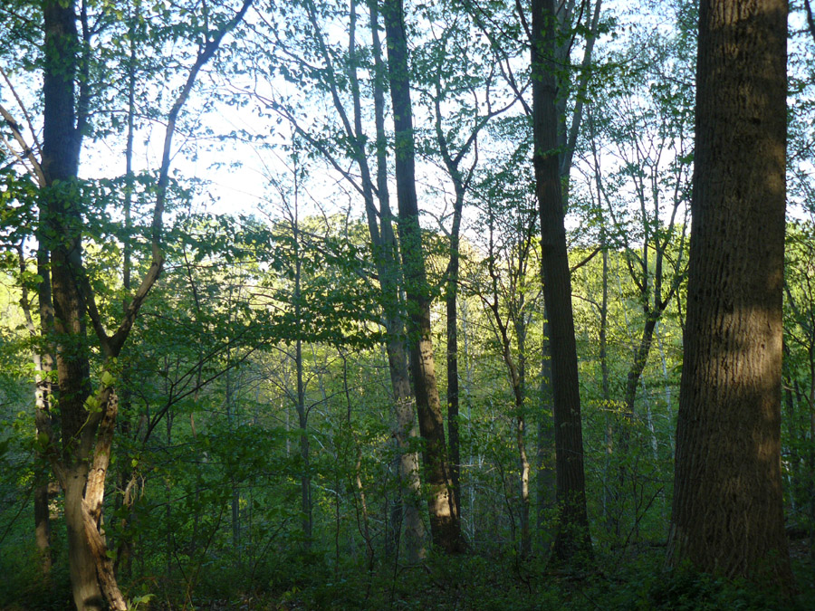
 Location Taken: Savage, Maryland
Date Taken: April 2010
Do you know how difficult it is to get a good shot of a forest from inside the forest? Forests from a distance are really easy, and individual trees are fairly easy, assuming you have good light, but a Mid-Range forest picture? Those almost never turn out.
There’s a few things working against such pictures. First, the lighting is almost always iffy. Forests are full of shade, which, while delightful to walk in, isn’t the best thing for interesting photos. Second, all the trees kinda, well, look alike. And if you have a particularly interesting tree, it’s better to make that tree the focus – which makes it no longer a photo of the forest. Otherwise, you have many similar shapes that, thanks to the disorganization of nature, tends not to make a decent composition. The tree trunks tend to go straight up and down, which only serves to lead the eye out of the photo – which is not what you want to do. And the undergrowth tends to be a chaotic tangle, with no discernible lines to lead the eye anywhere.
Just about all the forest photos I take end up flat and uninteresting, no matter how nifty the forest was to walk in. The lighting removes all contrast, or the composition does nothing.
It takes a pretty rare combination to pull it off. This photo actually manages it. First, it was taken near sunset, with the light coming through the trees at a low angle, which actually let it bypass the shading canopy. Second, this patch of trees is above a river. It is a little tough to tell, but the hill behind these trees slopes down rather steeply. This lets the trees in the foreground stand on their own, rather than fading into the mess that is other trees. Third, because of the hill, the trees are growing at slightly odd angles. Very few of them are straight up and down, stopping them from just sliding the eye off the image.
Now, it isn’t perfect. The composition still is lacking something, mainly a clear focal point. There’s a few contenders for that point, which leads to visual clutter. And the top part is silhouetted against the bright sky, which is a tad too bright. It washes out the trees rather than letting them do a proper silhouette.
Still, it is nice to see a forest photo actually turn out, for once.
