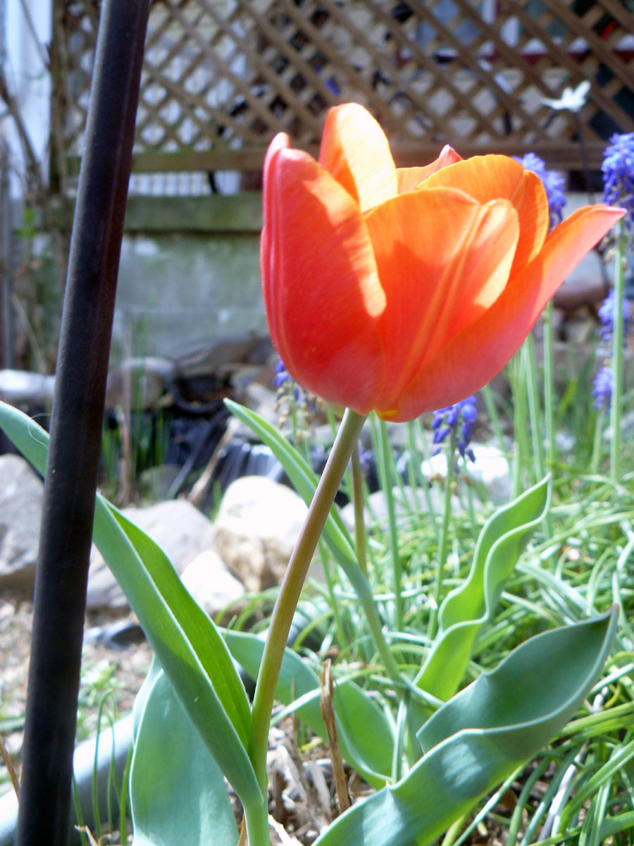
 Location Taken: Savage, Maryland
Time Taken: March 2012
I have a whole lot of photos that need a bit of retouching for one reason or another. The vast majority is for one simple reason: I forgot to change settings on my camera.
You see, my camera has a set of color settings. I can set it to “warm” to shift the colors towards the yellows and “cool” to shift it towards the blues. I use the “cool” setting when I do any indoor photography. Most indoor lights don’t produce the full spectrum, instead focusing on the yellow tones. It’s simpler to do, and our human eyes adjust easily. My camera doesn’t adjust, so I have to do so automatically.
The problem comes after that. I occasionally forget to shift it back to the normal setting.
This means a whole series of photos turn out a bit bluer than they should. And it usually takes me a bit to notice. I’ve done it twice now, each time taking some thirty or forty photos before I realize that the reason they don’t quite have the right zest is that I goofed. I’m aware of the problem now, and am more diligent about it, but that doesn’t change the fact that I have eighty or so photos that need some help.
And there are some good ones in there, too, so I’m not going to abandon them entirely.
This photo is one of them. Just a simple tulip from the garden. I only did one thing to the photo to shift it from a piece with a gray-blue cast over it to this. I tried Photoshop’s Auto Color feature. One click and it brightened right up.
I’m not sure it’s quite right, but I’ve always had trouble telling if the color balance is right. I had to do it a lot when I was taking film photography classes, and most of mine didn’t turn out perfect. So I usually leave the color balance where it is on my digital photos, not touching them up at all. And I’m trying the automatic features because my attempts at doing it manually weren’t fully working.
My eyes adjust too much, you see. They quickly get used to the odd coloration and accept it as normal. It’s why I took so many photos in the wrong setting in the first place.
And it’s why I’m not entirely certain this looks quite right. What do you think?
