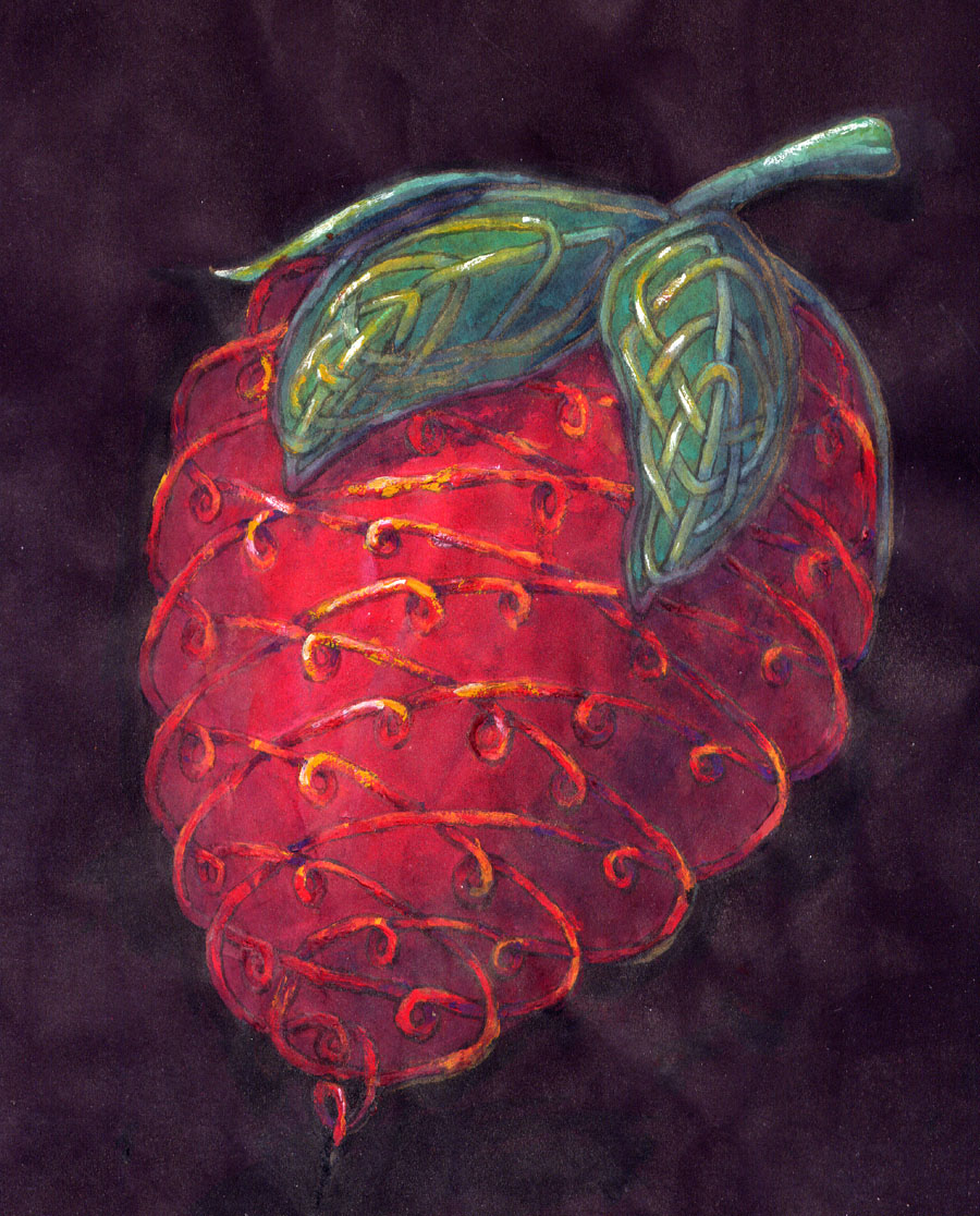
This piece was an experiment on two levels. First, I painted it on black construction paper (the heaviest black paper I could find), and second, well, it’s a Celtic knotwork strawberry! Have you ever seen that before?!
I had fun laying out the lines, figuring out how to give a hint of the seeds using them. The lines on the leaves mimic the veins you find if you look closely at them.
Working on black paper meant several difficulties. First, it takes a lot of paint to build up a strong enough color. When you’re working on white, even the slightest tint shows, but on black, it fades into the background. It took me a long time to finally get to the right hues, painting and repainting the entire thing several times. I suspect that’s part of why it has a luminous look. The paint I use has a bit of transparency to it, so all the layering shows through.
I really wish I could find a thicker black paper, one that has a non-water soluble dye. if you see the faint color variation in the background, it’s from the wrinkles on the paper. some parts of the paper collected a bit too much water and the dye flowed to other parts of the page.
Which leads to an interesting discover; black construction paper is actually a really dark purple. It does make a bit of sense. If you compare a gray and a purple of about the same value level, the purple does look darker. I wouldn’t be surprised if it’s a bit cheaper too.
Finding think black paper is difficult. Most places don’t dye their thicker papers, and none of the thinner ones can stand up to the water I use in my painting. Perhaps I’ll have to experiment with dying my own paper at some point.
I really do like how working on black makes the piece glow in a very different way than working on white does.

