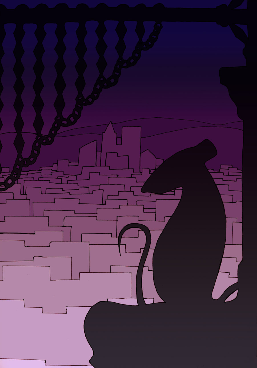
Like I promised last week, I’ve colored this piece the way I always intended to.
Of course, these days, I can think of a bunch of other things I could do, but most of them add lots of detail work, which would take a long time. And there is a simplicity to this that I like.
Oh, and if you’re convinced that each building has a gradient on it lighting it on the top, you’re wrong. They’re all flat colors.
That illusion’s due to a concept known in art as Simultaneous Contrast. Basically, your brain adjusts colors based on what’s around it. In this case, at the bottom of the buildings, it compares the color to the brighter one below and designated that area “dark”. At the top, it’s doing the same comparison to the darker area and designating the same color that is “dark” below as “light”. Which forms the gradient illusion you see, as the brain tries to make sense of the conflict. It vanishes if you stare at each building for a bit, as your brain gets more data and finally correctly labels the area as a flat color.
There is a bunch of gradients going on that aren’t illusions, mind you. I didn’t cover the sky with a flat color like I did for the buildings. And I let the background gradient show through on the dark areas in the foreground. And, of course, I worked off of that gradient to get the colors for the different areas of buildings.
It makes a pretty convincing illusion of a lighted city, doesn’t it? Not bad for a bunch of gradients, real or not.

