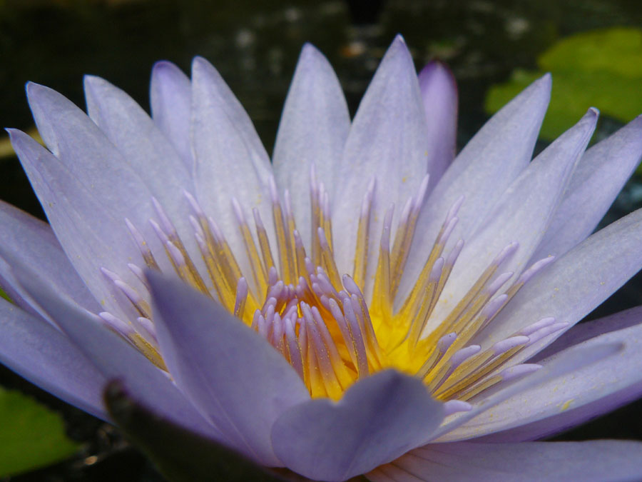
 Location Taken: Pacific Science Center’s Butterfly Room, Seattle, WA
Time Taken: June 2008
This is one of my most fantastic photos, but I’ve held off on posting it because, well, it’s a flower, what else can you talk about?
Well, to be specific, it’s a lilypad flower. Not a lotus, mind, a lot of people get them confused. And well, they are similar, but this is a lilypad. It’s got round leaves that lay flat on the surface, and the flower center is actually completely different between species.
And it does have marvelous coloration, with the delicate purple on the petals and that shock of brilliant yellow in the center. The way the color transitions from yellow to purple on the stamens just seals the deal.
It helps that yellow and purple are complementary colors. That’s colors that are opposite each other on the color wheel. When complementary colors are placed next to each other, the contrasting wavelengths makes both colors “pop”, aka become more interesting and vibrant than they actually are.
Complementary colors are used a lot. Red and green is a pretty common pairing (just think Christmas), and blue and orange are being used increasingly often for movies. Purple and yellow, the last of the primary-secondary complementaries, isn’t too common. Perhaps because unlike the other two, it’s not THAT common naturally. Red and green is found in every plant with red flowers and berries, while orange and blue – well, skin tone is closer to orange than any of the other primary/secondary colors and blue is in the sky and sea. Purple and yellow tend to be relegated to certain sunsets and to flowers like this one, that go out of their way to chose those colors.
Oh, and nudibranchs. Can’t forget the nudibranchs.
