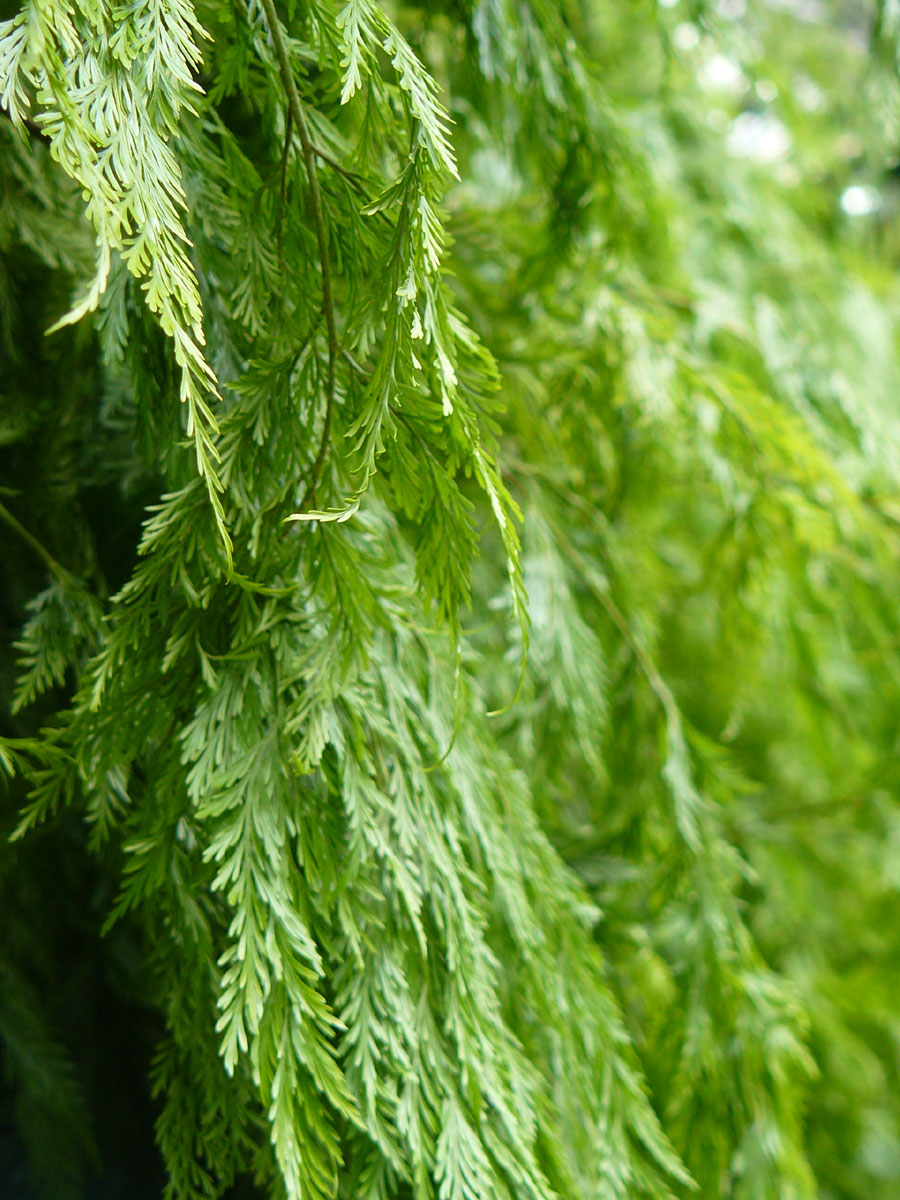
 Location Taken: Garfield Park Conservatory, Chicago, Illinois
Time Taken: April 2008
I’m going to take advantage of my goofing up two weeks ago (I forgot to post an “artwork” that Sunday and just skipped ahead in the schedule), and start showing photographs on every other Sunday from here on.
This is completely related to the fact that I’m not producing new artwork at the rate of one per week, so my backlog is dwindling…
This photo, actually, could be used for artwork. Or more specifically, graphic design. All you’d have to do is put “Introduction to Biology” in an appropriate font in the top right, and it’d be an instant textbook cover. It’s perfect for such uses!
Photos like this, where you have an interesting photo that is still all one color and subject, are tough to make. And they pretty much always require both color contrast and focus contrast to work (this photo has both, obviously). They’re great for textbook cover art, or poster backgrounds, or the generic sort of art you see in hotels (though this particular one doesn’t match the color schemes most hotels use).
It’s also why I need cameras with an easy-to-use manual focusing option. The auto-focus most cameras have would have tried to get as much of the leaves in focus as it could, most likely choosing the mid-ground and blurring both ends. You wouldn’t get the crisp focus along the edge like I did, that’s for certain. And that would ruin the photo. It’d just be a picture of some leaves.
Well, ok, even my photo is just a picture of some leaves, but it’s an interesting one!
