A large part of why I got into art was being bored in class. Well, I also had a talent for it from a young age, and I also got a big boost from when I started watching anime, but still…
I’m one of those people who learn really fast. Far faster than average, even when the average is the Gifted and Talented classes in high school (yes, that’s what they were called), where everyone was a smart cookie. And well, if I’ve figured out something by halfway through the subject, I get bored and mentally wander off a bit. I also am a kinesthetic learner, and taking notes and doodling vastly increase how well I learn the subject, even if it has absolutely nothing to do with what I’m learning.
Add in the fact that the teachers didn’t mind at all (I did excellent on the tests, and the only reason I didn’t do well in some classes was because I hated homework), and I spent most of my classes drawing. I carried a sketchbook along with my school books, and usually filled it by the end of the school year.
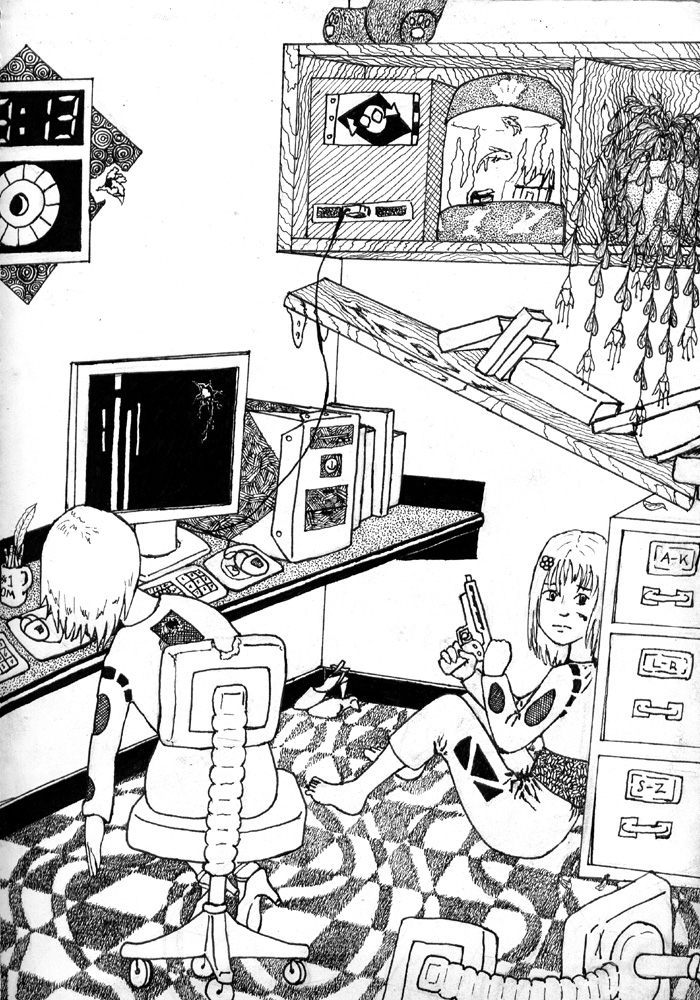
A lot of my drawings are associated with one class or another in my memory. Some classes are more prone to my doing full drawings, since they have more time sitting around learning and less time taking notes (I got to the point where I only needed to take detailed notes in data-dense classes) or, say, making other art. This one I associate with my Human Geography class, and just looking at it brings back memories of what I was taught. We had a lot of discussion sessions in that class, where we all sat in a big circle and talked out the nuances of the subject, whether about population density or age diversity by region or the dynamics of outsourcing. Being the introverted social phobe I am, I generally dislike such classes, and don’t really participate. Which made it a great time for drawing, especially since aside from a few basics, what we were discussing never made it to the tests.
As for the piece itself, I’m only half-happy with it. Mechanically it came out pretty well, though I can easily spot the issues with perspective and proportions that were common in my art of the time. I certainly went overboard with the textures, but they all came out nice. I’m especially proud of that textured carpet. Drawing all those tiny lines took a long time.
Composition and comprehension is where it starts to fall apart. I didn’t really establish any focal points, so it’s easy for the eye to wander around lost. As for comprehension, I got a few comments from friends and classmates along the lines of “so that girl shot the other one?” And here I’d gone and tried to put in all sorts of clues that there was a gunman off screen that the living girl was hiding from!
I’ve got the gunshots all over that wall, far too wide spread for a close shooter. The two girls are wearing the same outfit, a uniform of some type, and there’s a tipped over chair that the living one had been using. She’s also hiding behind the filing cabinet, the only thing in the picture that blocks the sight from the direction she’s anxiously looking at.
Nowadays, I can see how I could fix this. For one thing, make the emotion on her face more clear. I’m still not that good at showing strong emotions on faces, but I can manage it with references. There’s the general cleaning up of perspective and proportion that would make it a cleaner piece overall. And, perhaps most importantly, adding shadows. I think I was planning to color this on the computer, and left out all but the darkest shadows intentionally. But just adding the shadow of a human coming from off screen would instantly make it clear where the danger was.
With all the other issues, I’m not going to spend the time to fix it now, six years after I drew it. But at least I can now spot where I went off, so I can look for it in the future. Though I don’t get quite as many pieces of art done these days. Something about not having classes where I sit around bored so often…

