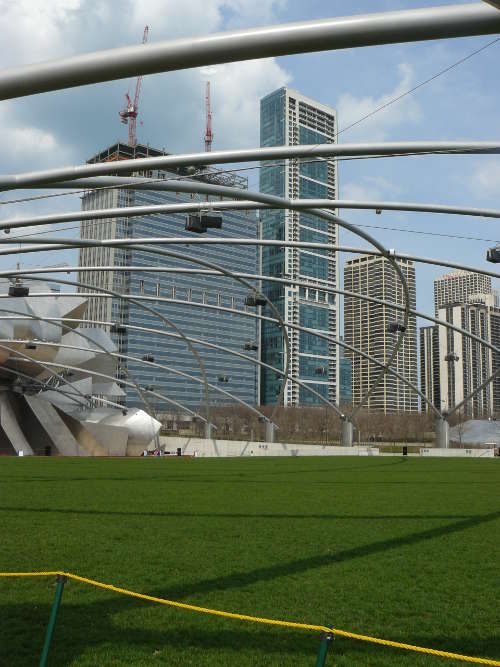
 Location Taken: Chicago, Illinois
Time Taken: April 2008
There’s a certain modern style of architecture that believes in making anywhere where acoustics matter look somewhat like a giant metal flower. I know it’s got all sorts of benefits, and certain examples of it come out looking decent, but most of them just look like a lump of shiny grey petals littering the ground.
The big music pavilion in Millennium Park in the heart of Chicago is no exception.
But it does have one element I like.
One of the challenges for designing a space to hold a very large amount of people is how to properly distribute lights and speakers so that every spot in the crowd is covered well. Here, they did a nifty criss-cross of curving beams across the whole grassy field, and hung the lights and speakers on that. What it does is divide up the view into these rhomboid shapes that actually help draw the eye towards contemplating the scenery and appreciating it.
It’s called the framing effect, where setting an area (or picture, or view) apart using basic shapes in a non-assertive fashion makes that area more interesting. It’s why paintings have frames, comic strips have panels, and why I put the little lines around all my photos. It’s one of those odd psychological tricks, where just adding something to say “this is set apart and thus special” actually makes people think it looks at least twice as appealing as if it were unframed.
Which sometimes really irks the artist in me, you know. If just putting a black line around something doubles its appeal, does that mean all that effort I put into making that item could have gone into just making two black lines? I know it doesn’t really work that way, but still…
