When I was first getting into digital photography, I tried all sorts of things to combine it with the drawings I already did. This is rather difficult, since well, you’re combining a highly-detailed photograph with a much simpler drawing. Unless you either take the time to add so much detail to the drawing that they mesh, or have so much skill that you can fit the two disparate styles together, there’s going to be a disconnect.
I, alas, have neither the patience for quite that level of detail nor the skill required. But still, I tried.
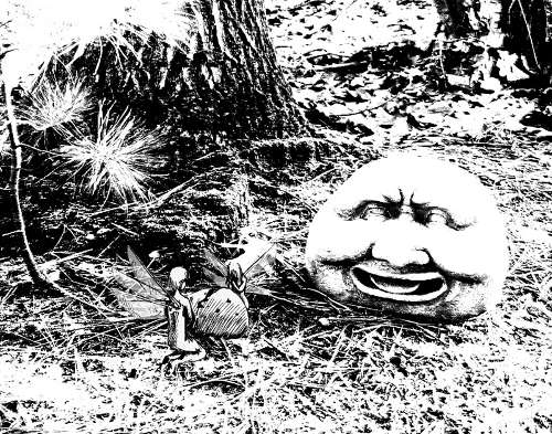
In order to reduce the detail in the photograph, I first converted it to grayscale, and then, shall we say, removed all the gray. This left a black and white photo of one of the many odd garden statues my Grandmother has scattered throughout her property. Said statue also added its own simplified aspects, with the smoother lines and open areas of the stone face providing an intermediary step to help the composition fit together.
I then added in a quick drawing I did in pen, scanned into the computer. I twitch at my poor sense of body proportion and how large the lines look in the image today, but well, we all wince at our older work. I manipulated the drawing so it was just the black lines, and transferred it over to the photo. Then I filled in the drawing with white so they weren’t see-through. As a final tweak, I made the wings of these fairies semi-transparent to let some of the background image show through, trying to incorporate the two even further.
For a quick piece, more proof of concept than anything else, I did quite well. And my warped sense of humor still likes pairing a laughing statue with fairies crying over a cracked egg. Not that it’s easy to tell that’s an egg. I really needed how to learn how to measure objects and use reference at this point…

