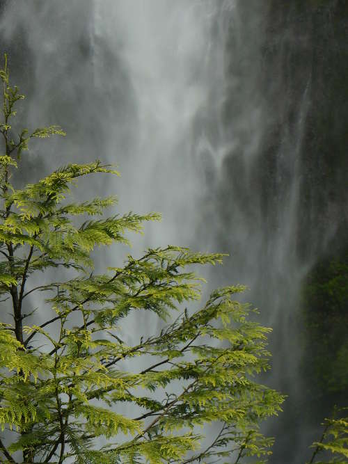
 Location Taken: Multnomah Falls, Oregon
Time Taken: June 2008
There have been plenty of times where I’ve been just randomly clicking through my photo thumbnails looking for one to post, only to find a hidden treasure. I’ll select a photo with a merely average thumbnail only to find that all the flaws fall away when the detail is revealed.
This photo is the opposite of that.
It looks really great as a thumbnail, an elegant mist against a dark background with some green stuff in front. But well, open it up and the pine tree just jumps out and punches you in the face. Not literally, though. Pine trees are horrible at punching.
It’s not a bad photo, mind you. I still quite like it. But it’s missing that certain undefinable something that separates the good photos from the great photos.
I think it’s a little too obvious that the pine tree is just part of a larger whole, most of which is off-screen. That makes the photo feel a bit awkwardly cropped, or perhaps zoomed in too much. It’s a subtle effect, but persistent.
Not to mention that the slight awkwardness just makes you pay even more attention to the tree, which makes it more awkward, which draws more attention, and so on. That beautiful cascade is nearly forgotten in all the hullabaloo.
