
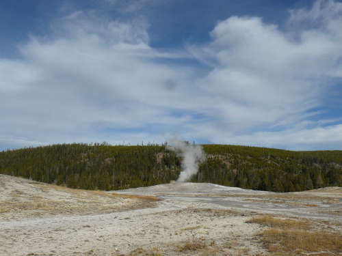
 Location Taken: Old Faithful, Yellowstone
Time Taken: October 2012
Sheesh, I share one awesome site I find with you yesterday and now I go and find another one.
This one’s a lot simpler, at least. It’s just a bunch of graphs, showing strong correlations between things.
Completely unrelated things.
For instance, “Per capita consumption of cheese in the US” and “Number of people who died by becoming tangled in their bedsheets”? VERY CLOSE MATCH. If you saw two similar lines on a graph tracking, say, appearance of steam from a geyser and time of eruption, you’d not even think twice about them being related.
But these things aren’t, at least not directly. So then, why do they match so well?
Picking and choosing data, of course. If you look through hundreds of possible data sets to compare, some will have matching graph patterns purely by chance. It’s, well, inevitable. There’s no way that every single pattern would be different, especially if you play with the scales on the graph.
Just scroll through those and think about how much you trust other graphs people put out, ones that aren’t quite so clearly unrelated. Some of those may just be coincidences, after all…
And, as always, remember that correlation does not imply causation!
If it did, well, we’d never eat cheese again. Or at least never use bedsheets again.