Blue-Yellow Flowers. No, not Green, Blue-Yellow!

Photo #351: Blue Yellow Flowers
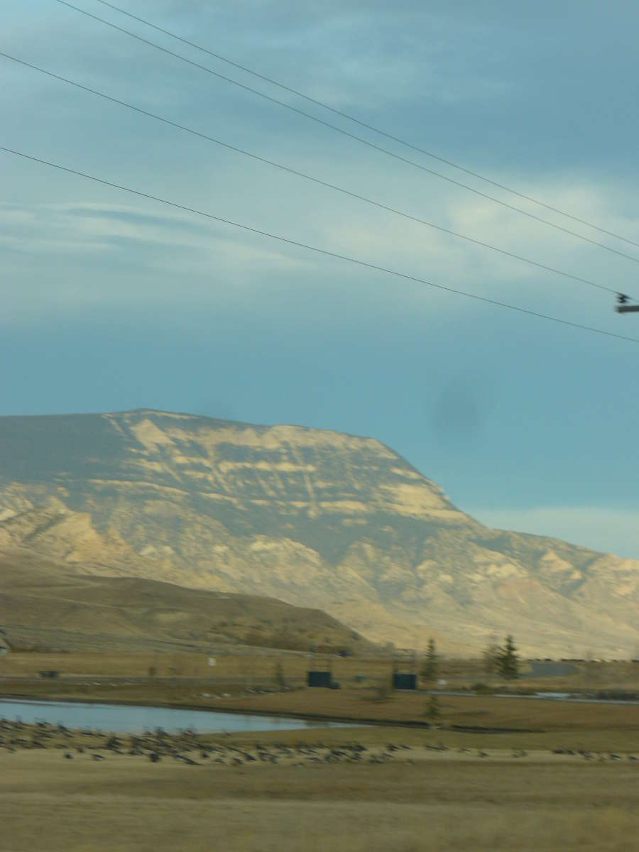
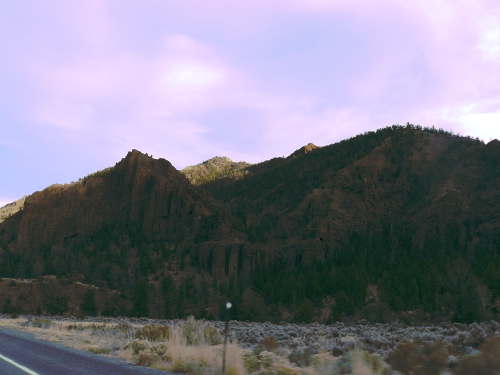
Location Taken: Skihist Provincial Park, British Columbia, Canada
Time Taken: June 2010

Now, like a lot of the photos this week, this one has odd colors. Unlike the others, though, I didn’t mess with it at all. This is exactly how it showed up in the viewscreen as I took the photo.

There’s a very odd time for lighting, just as the sun is setting and it’s almost too dark to easily read by. It’s still bright enough for color to show just fine, but everything is tinted towards the blues of night. The colors closest to blue and the neutral colors show it first, the warm yellows and oranges show it last.

So, for those few brief moments where the blue is showing in the neutral colors of, say, the dry grass in this photo, but hasn’t really overwhelmed the yellows, you can get odd color palettes like this one.

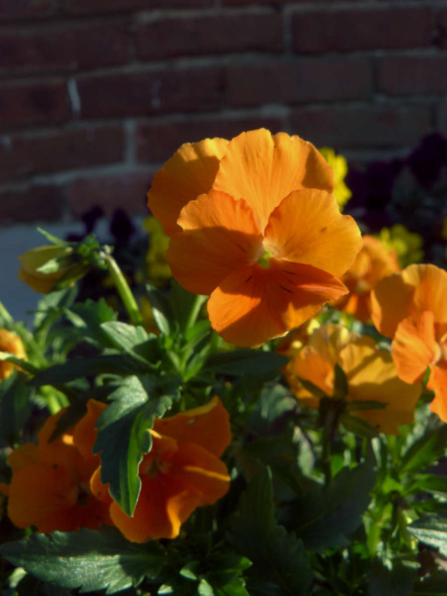
I do wish I’m managed to get the focus just a hair better, but this was a one-shot photo. And it’s still good enough. And it would be impossible to get all the parts I want in focus to actually be in focus anyway, since you get really small focal lengths this close to your subject.

And the soft edges actually help some, since it helps even out the balance between paying attention to the subject being photographed (the flowers) and what the shapes and colors in the piece are. And really, for this one, the second is more important.

Oh, and if you’re wondering why the yellow takes longer to gain the blue shades, well, technically it doesn’t. We just can’t see the color between yellow and blue (the one that’s not green). Blue and yellow use some of the same neural pathways that connect the eye and the brain, and if they’re roughly balanced, they cancel each other out. There are a few tricks to managing it, but you have to very deliberately do them.

So if your brain is having a touch of trouble with a few of the yellows in this picture, you’re not alone. They actually are on the edge of a color your brain doesn’t recognize.

Oh, and to throw you for another loop, there’s no actual yellow light going to your eyes from that, just a mix of the three tiny red, green, and blue sub-pixels that make up each pixel on your computer screen. Makes me wonder just how much the blue sub-pixel is turned on in some of those yellows…


Grumpy Sharayah Post Grumpy Post by Sharayah!

Photo #350: Blurry MountainLocation Taken: Wyoming
Time Taken: November 2012

Don’t wanna write post, wanna be grumpy!

I’mma post a blurry picture! That make people leave me alone so I can be properly grumpy.

Nothing ruin a good grump like people pestering you.

Hmmm… Don’t want to chase off forever. Still like people, on every other Wednesday, for at least three seconds each time!

Hmmm… Compromise! Post blurry picture with fantastic mountain! That work.

I’mma go be happy being grumpy now, bye bye!


Tweaking the Curves of the Cliffs

Photo #349: Shadowed CliffsLocation Taken: Wyoming
Time Taken: November 2012

I’ve continued playing around with the color manipulation options in the graphics program I’m learning, and well, today I played with a photo that I didn’t screw up!

Well, aside from the fact that I  took it entirely at the wrong time of day.  The sun was low and well, no matter how fantastic the cliffs lining the road are, they still will block light trying to go through them.  It’s like they’re made of solid rock or something crazy like that!

But well, it’s only a couple MB, I’ve got the space to take photos of imperfect setups that I’m not likely to visit again for months or years or decades.

So here’s the way it came out on the camera:

Photo #349: Shadowed Cliffs Dark

Not too bad, really, but the bright sky just completely overpowers the details in the cliff face.  So I went in there and tweaked that color this way and this color that way until it came out to a vaguely acceptable stage.

Really, that’s how it works.  I’m using a tool called Curves that, well, you’ve got lines representing aspects of the colors at various levels, say the red colors in the dark tones, shown on a graph.  If you tweak the line up a bit, a bit more red is added to the dark areas, and if you tweak it down it loses red.  And you just go through and tweak this little bit of the line a little up and that a little down to shift the colors around until it does what you want it to.

Ok, I’m finding that tough to understand without a picture and I’m the one who wrote it, so bam, picture!

Photo #349: Shadowed Cliffs Curves

It really doesn’t take much to shift the colors.  You may notice how close those lines still are to their starting point, which was a simple straight 45 degree line from corner to corner.  I only moved the line up or down by 10 or so pixels at each of the points.  It’s really easy to get it off, and small movements make a big difference.

If you don’t believe me, well, that set of curves isn’t for either of the versions above.  I didn’t think to take a screenshot of that while I was tweaking, so I just roughed one up later, pushing the lines up and down semi-randomly.

THIS is what those curves produced:

Photo #349: Shadowed Cliffs Odd

I especially like the pink sky.

And just think, this is an EASY graphics tool to use!  There’s FAR more difficult ones out there!


So, on the Scale of Weak Tea to Florida, how Orange are these Pansies?

Photo #348: Orange PansiesLocation Taken: Savage Mill, Savage, Maryland
Time Taken: April 2012

I think I’m getting better at manipulating the colors of photos in GIMP. It’s been a bit odd not using Photoshop at all, but I’m getting the hang of it.

And I think I’ve smoothed out the results of accidentally taking this photo in “cool” mode, which originally made it far too blue in tone.

It’s such a dynamic photo already, with the brilliant orange of these pansies, it was a shame to have the orange washed out from the blue overlay.

So even while I’m still running under the weather from the stomach bug and saddened by the lack of whiteness out my window (the snow turned to rain mid-day and melted what had fallen), I decided I needed to fix this photo as soon as I spotted it.

And it is such a beautiful flower. Well, photo of a flower, the flower itself did its job and faded away nearly a year ago. Always important to keep things like that straight, especially when your brain is already having trouble keeping things straight.


Snow, snow, come again, come and stay every day!

Photo #347: Snowy DaysLocation Taken: Arcadia, Michigan
Time Taken: January 2011

We’re supposed to be hit by a major snowstorm tonight. It’s a big deal and all, what with it being March. They’re predicting 4-8 inches of snow and rain, starting perhaps at 6 pm.

Hmm, it’s 10 pm now. Let me check outside…

Nope, no snow. Doesn’t look like it’s rained either. And I didn’t feel any rain when I stuck my arm out the window.

The weather app that came with Windows 8 is saying 90% chance of snow right now. Right. At least the Weather Channel has more up-to-date forecasts, saying only 20%. And there is a band of rain hanging out just south of here. It just hasn’t moved north yet. It’s supposed to do so in a couple hours, with the 100% rate hitting at 4 in the morning.

Perhaps I shall wake up tomorrow to find a glorious blanket of snow (which if the predictions are correct, is more total snow than we’ve seen in the entirety of the last two winters combined…).

But for now I shall just go through my snowy pictures and dream of whiter, colder times.