A Fleeting View of a Fjord

Location Taken: Gros Morne National Park, Newfoundland, Canada
Time Taken: July 2012

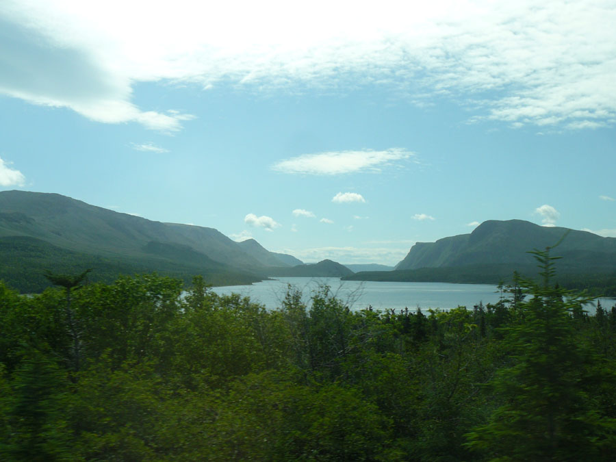
Every so often, you just see a scene out of the side of your eye that catches and holds your imagination. All too often, this is while you’re doing something that quickly removes you from seeing that perfect angle. In this case, it was a rise on the way to our campsite by Trout River Pond in the southern part of the park that just opened up a beautiful view of the pond itself.

We couldn’t stop, since there was a car coming up behind us, but it was far enough away that we could slow down some. So there’s a little blur in the trees in front, but not that much. And oh, the view!

Trout River Pond is actually a fjord. Well, I’m not sure if this part is. But the larger bulk of it, between those steep cliffs in the background, that part certainly is a fjord. Steep cliffs and the U-shaped valley are key signs of a glacier-carved valley, and the water filling the bottom makes it a fjord. I’m mostly telling you this because fjord is an awesome word to type. Fjord fjord fjord.


A Cascade of Green

Location Taken: Garfield Park Conservatory, Chicago, Illinois
Time Taken: April 2008

I’m going to take advantage of my goofing up two weeks ago (I forgot to post an “artwork” that Sunday and just skipped ahead in the schedule), and start showing photographs on every other Sunday from here on.

This is completely related to the fact that I’m not producing new artwork at the rate of one per week, so my backlog is dwindling…

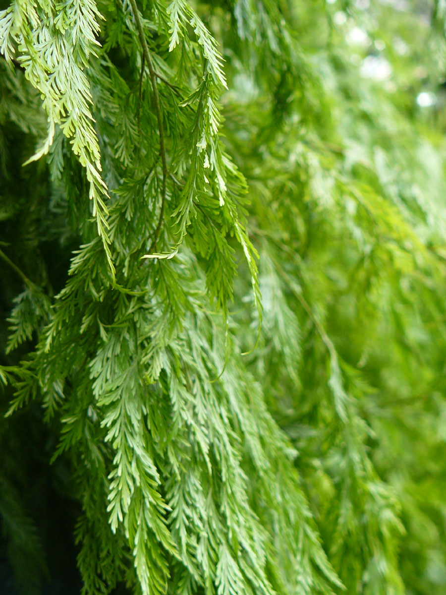
This photo, actually, could be used for artwork. Or more specifically, graphic design. All you’d have to do is put “Introduction to Biology” in an appropriate font in the top right, and it’d be an instant textbook cover. It’s perfect for such uses!

Photos like this, where you have an interesting photo that is still all one color and subject, are tough to make. And they pretty much always require both color contrast and focus contrast to work (this photo has both, obviously). They’re great for textbook cover art, or poster backgrounds, or the generic sort of art you see in hotels (though this particular one doesn’t match the color schemes most hotels use).

It’s also why I need cameras with an easy-to-use manual focusing option. The auto-focus most cameras have would have tried to get as much of the leaves in focus as it could, most likely choosing the mid-ground and blurring both ends. You wouldn’t get the crisp focus along the edge like I did, that’s for certain. And that would ruin the photo. It’d just be a picture of some leaves.

Well, ok, even my photo is just a picture of some leaves, but it’s an interesting one!


Ah, the Joy of Complements!

Location Taken: Pacific Science Center’s Butterfly Room, Seattle, WA
Time Taken: June 2008

This is one of my most fantastic photos, but I’ve held off on posting it because, well, it’s a flower, what else can you talk about?

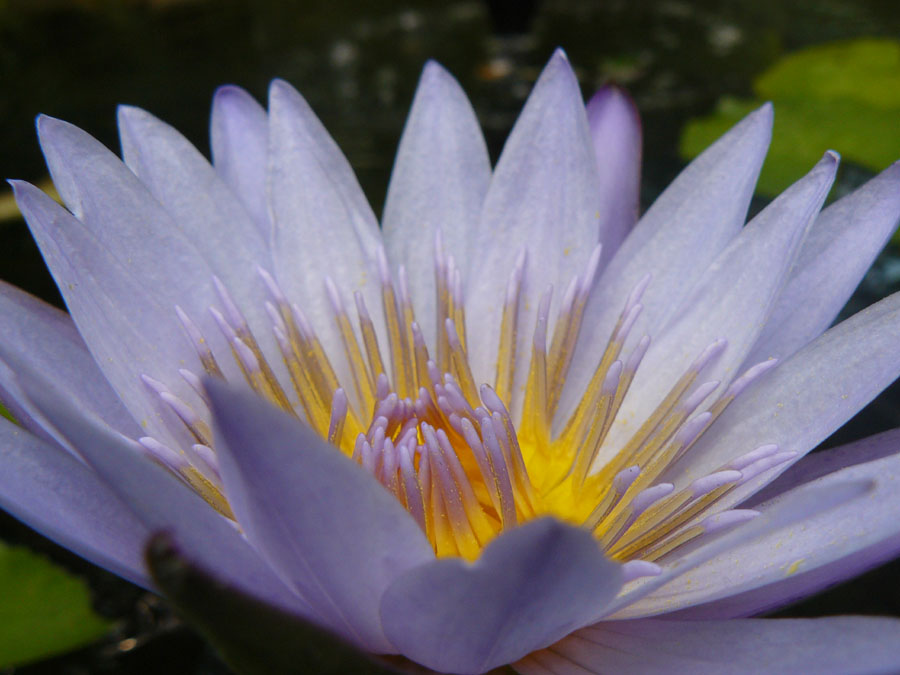
Well, to be specific, it’s a lilypad flower. Not a lotus, mind, a lot of people get them confused. And well, they are similar, but this is a lilypad. It’s got round leaves that lay flat on the surface, and the flower center is actually completely different between species.

And it does have marvelous coloration, with the delicate purple on the petals and that shock of brilliant yellow in the center. The way the color transitions from yellow to purple on the stamens just seals the deal.

It helps that yellow and purple are complementary colors. That’s colors that are opposite each other on the color wheel. When complementary colors are placed next to each other, the contrasting wavelengths makes both colors “pop”, aka become more interesting and vibrant than they actually are.

Complementary colors are used a lot. Red and green is a pretty common pairing (just think Christmas), and blue and orange are being used increasingly often for movies. Purple and yellow, the last of the primary-secondary complementaries, isn’t too common. Perhaps because unlike the other two, it’s not THAT common naturally. Red and green is found in every plant with red flowers and berries, while orange and blue – well, skin tone is closer to orange than any of the other primary/secondary colors and blue is in the sky and sea. Purple and yellow tend to be relegated to certain sunsets and to flowers like this one, that go out of their way to chose those colors.

Oh, and nudibranchs. Can’t forget the nudibranchs.


The Sunset of Chain Bookstores, the Brilliant Moonrise of Digital Bookstores

Location Taken: Arcadia, Michigan
Time Taken: May 2011

Sometimes it’s peculiar how companies seem to shoot themselves in the foot.

Yesterday, for the first time in a bit, my mom and I went out to buy a book. Now, we’re both voracious readers, but she’s got a Nook and buys most of her books electronically these days, whereas I tend to either read from our already extensive collection or hit the library. But a new book by one of our favorite authors, Lois McMaster Bujold, had come out. It’s Captain Vorpatril’s Alliance, the fourteenth book in her fabulous Vorkosigan series. I probably wouldn’t suggest starting with it, since the world is so solidly developed that she can’t take time to explain all the characters she throws in to each book any more, but I do solidly recommend reading this series if you have ANY interest in, well, good books. Start with Shards of Honor or the omnibus that includes it, Cordelia’s Honor. Seriously.

Not that you’d have any easy time finding it at certain stores. Our old preferred bookstore was a Borders, and when that closed due to bankruptcy a year or so ago, it was replaced rather quickly with a BAM! Yes, that’s what they decided to put on the sign out front, “BAM!” I’ll not elaborate what that means, because either their branding worked and you know what it means or, much much more likely, it failed entirely and doesn’t matter anyway. Anyway, it’s still the closest bookstore to us, so that’s where we went first to find this new book in a popular science fiction series by a well-awarded science fiction and fantasy author.

They didn’t have it. We looked in the fancy new arrivals display, the not so fancy new arrivals in science fiction display, and then just on the shelf. In fact, they only had one book by Bujold period, one lone copy of Cryoburn (the previous book in the series, and again, one I wouldn’t recommend to start reading the series with). And it’s not like they didn’t have the shelf space. They’d both reduced the amount of shelf space available compared to the layout Borders had in the exact same location, and decided to turn a lot of their books face-out, so the pretty picture on front showed. Which generally meant one book in the space that three or four could have taken. Oh, and the popular books? Those had shelves to themselves, full of fifty copies of just one book and a large assortment of copycat books hoping to get picked up by foolish people who assume that they look the same, and thus must be just as good. But well-loved science fiction author? Nah, let’s not give her any space or bother stocking her newest book. Science fiction is a chump’s genre, anyway…

So we had to go to another bookstore. It’s far enough away from my house that we really never get out to that corner of the world. Which, in this over-crowded area, means about ten miles away. But it was ten miles in the direction we’d already gone five miles in, so to that store we went. We walked in, and right there in front of the door on their top tier new arrivals shelf was a large stack of copies of Captain Vorpatril’s Alliance. Didn’t even have to go to the genre’s shelves, just grabbed it and bought it, nice and easy.

The first bookstore is part of why so many people think the book industry is dying. The second one is part of why it’s not and is in fact booming. The first bookstore was nearly empty of people, and half the store was dedicated to non-book materials. Heck, they had a scented candle display right by the check-out line, which shows a real lack of comprehension of the differences of human biology. Neither mom nor I can go within five feet of such displays without holding our breath lest we get nasty headaches. Putting it next to a place you expect people to be standing in for a couple minutes is just cruel! And of course, one of the easiest ways for a business to fail is, quite simply, not offering what people want to buy. We couldn’t buy the book we wanted there, so we (obviously) didn’t. That’s a solid lost sale. And in fact, lost customers in general. We’ll probably either go to that other book store or just order the books online.

Which is a large part of why the book industry isn’t dying: it’s just moved digital. Lots of people have eReaders these days, and are buying more books than ever for them. And if you want a physical copy because, say, you want to share the book with family members who don’t have eReaders, it’s really easy to find them at online retailers. Just wait a couple extra days and it’ll be delivered right to your front door. And the bookstore that was well stocked? It wasn’t empty like the other one, it was nicely crowded.  They’ve also got a really strong tie-in to a popular eReader, so they’re doing well digitally too. Amazing how well actually selling what people want to buy works, no?
  

HOLE!! *giggle*

Location Taken: Valparaiso, Indiana
Time Taken: March 2007

I’m oddly fascinated with construction sites. It’s my engineer blood, I’m sure (both of my grandfathers were engineers, one civil, one mechanical). Oh, and my geologist tendencies just add in to the pile. Where other people see ugly messes, I see places where the dirt is revealed and the power of water made clear. (By that, I mean the erosion patterns that pop up in the bare loose dirt whenever it rains are really nifty).

I also see somewhat funny signs. Like this one, which says “HOLE”.

Gee, go figure?

I suppose it’s not TOO obvious, since they’ve capped the pipe, but it’s also in a pretty noticeable dip in the ground as well. Especially when you add in the water still filling in the bottom in the hole.

And I’m sure they chose bright green so it’d be noticeable for, say, backhoe drivers thinking of backing up over the area, but really, basic black would have been a better choice. The green’s too close in value to the color of the wood, so it just blends right in. Ah well, it’s a common mistake. A lot of people see a bright colored paint and say “hey, that will show up really well!” and then mess it all up by putting it on the paper color they chose.

Still, “HOLE”. So oddly amusing…