Hidden Treasure, Gleaming Gold

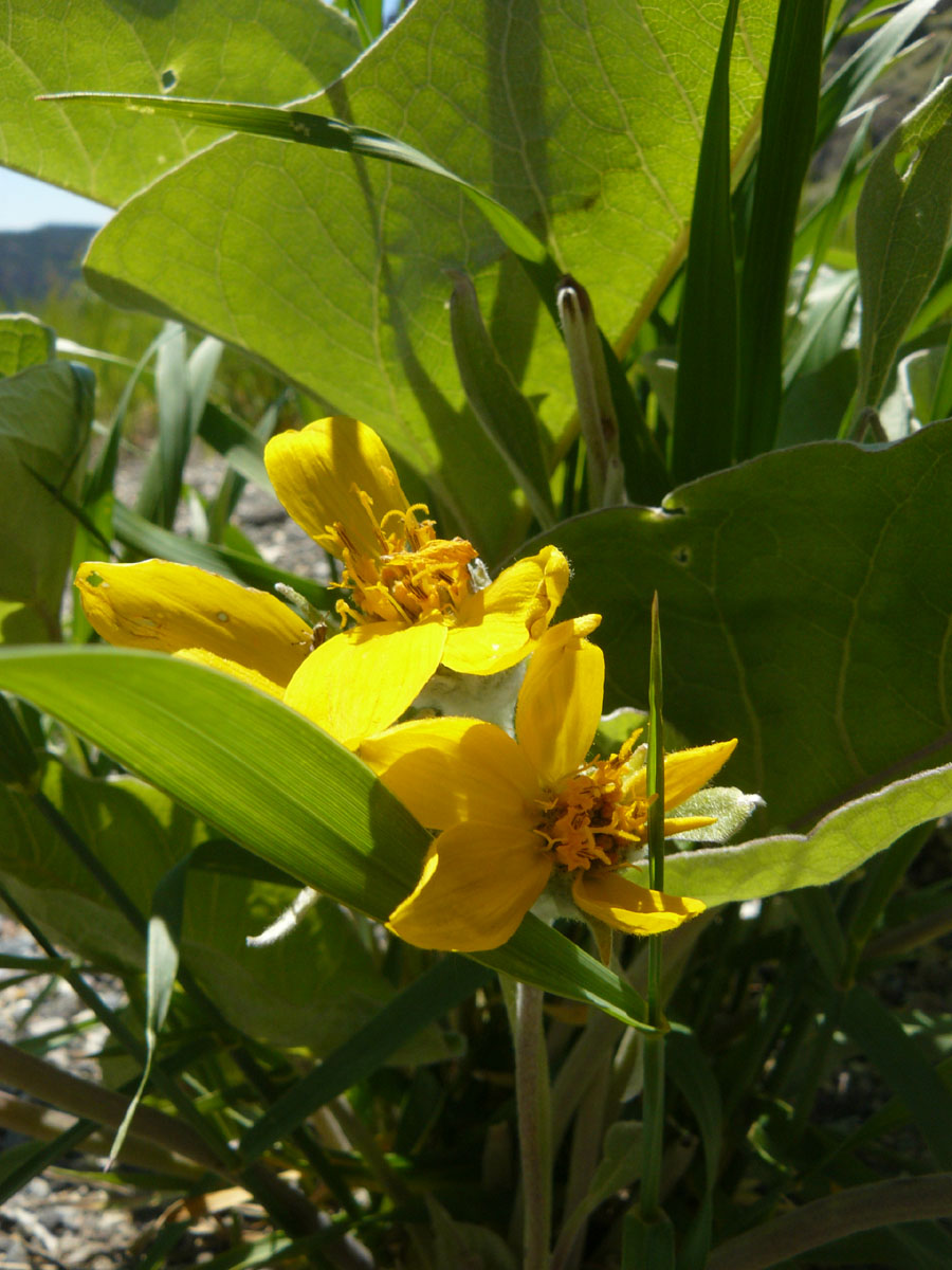
Location Taken: Wyoming
Time Taken: June 2010

I love the shadows on this one. It’s a small flower overshadowed by larger leaves, and yet there is still enough light coming through to make the yellow pop, while the darkness keeps it tamed.

It was just growing on the side of the road, right by a scenic pulloff. There was a fantastic view of the canyon we were driving through, and I did take plenty of pictures of that. But I also spotted these flowers.

That’s one thing I really like about digital photography. When I was first learning the art of photography, I used a film camera. I always had to carefully pick and choose what I took photos of since I only got 29 photos per roll of film, and I wouldn’t have a clue how it turned out until I developed it. I’d probably not have continued looking around for things to photograph after I got a few of the canyon, and would not have spotted the flowers.

I wouldn’t want to waste those 29 spaces for just anything, after all. And film takes up space, and the cost adds up quickly, so I didn’t carry too many extra rolls on me. Digital, though, gives me much more. I have space for hundreds of photos, if not thousands, on my memory card, and a backup memory card if I run out. And I can see the photo right as I take it, so I can delete it if it’s not up to snuff, and try again.

And, most important, I never have to stop taking photos just because I’m out of film. I can poke my nose into odd spots and say “yes, I will see if this is more interesting from this angle.” And guess what, it frequently is. And if it’s not, well, I’ll delete it and try again.

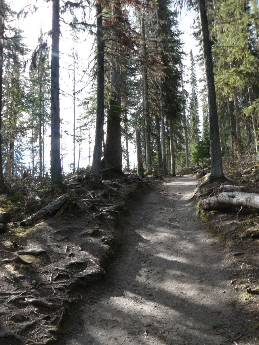
  

A Path to Who Knows Where

Location Taken: Banff National Park, Alberta, Canada
Time Taken: June 2010

There’s something magical about seeing a well-worn path going into the woods.

Perhaps it leads to an interesting lake, or an old house, or just winds its way through the woods on the favorite walking path of someone unknown.

And there is no way to know unless you take it. Either you turn away from your planned route and explore, or you leave it an eternal mystery.

Of course, sometimes you are already at the interesting side, and it just leads back to something boring. Like a parking lot. That’s the risk you take.


Just Some Mountains. Some Really Really Pretty Mountains.

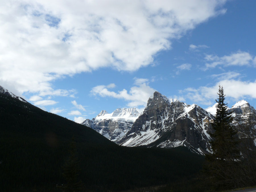
Location Taken: Banff National Park, Alberta
Time Taken: June 2010

I’m switching my “Random” posts to Friday and moving the other days up. I’m just finding myself short on time and brain power on Sunday evenings. And today is the one Monday I have to work at the Renn Fest, too, so while I do have a post in mind, I don’t have the time to write it.

So I shall just leave you with this magnificent photo of some mountains in Banff National Park. That park is full of such mountains, so I don’t have much to say about any one individual one. Which makes it a great candidate for a day I’m short on time.

Enjoy!


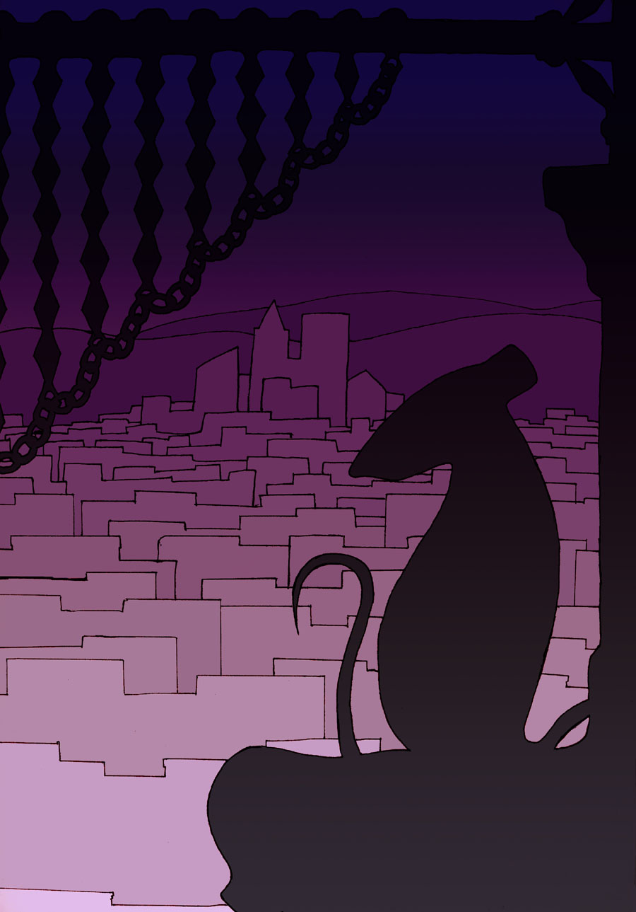
A City of Light, a Rat in Darkness

Time Drawn: September 2012

Like I promised last week, I’ve colored this piece the way I always intended to.

Of course, these days, I can think of a bunch of other things I could do, but most of them add lots of detail work, which would take a long time. And there is a simplicity to this that I like.

Oh, and if you’re convinced that each building has a gradient on it lighting it on the top, you’re wrong. They’re all flat colors.

That illusion’s due to a concept known in art as Simultaneous Contrast. Basically, your brain adjusts colors based on what’s around it. In this case, at the bottom of the buildings, it compares the color to the brighter one below and designated that area “dark”. At the top, it’s doing the same comparison to the darker area and designating the same color that is “dark” below as “light”. Which forms the gradient illusion you see, as the brain tries to make sense of the conflict. It vanishes if you stare at each building for a bit, as your brain gets more data and finally correctly labels the area as a flat color.

There is a bunch of gradients going on that aren’t illusions, mind you. I didn’t cover the sky with a flat color like I did for the buildings. And I let the background gradient show through on the dark areas in the foreground. And, of course, I worked off of that gradient to get the colors for the different areas of buildings.

It makes a pretty convincing illusion of a lighted city, doesn’t it? Not bad for a bunch of gradients, real or not.


Perfection Reflected

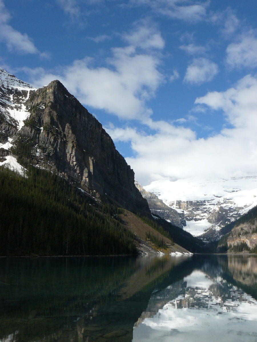
Location Taken: Lake Louise, Alberta, Canada
Time Taken: June 2010

There are some places that are really easy to take a good photograph of. The landscape is just so naturally beautiful that all you need is the right weather and bam, instant masterpiece.

Lake Louise is one of those places. A magnificent tarn (that’s a glacial lake up in the mountains, if you didn’t know), it has some of the clearest waters, and they reflect the dramatic mountains beautifully.

It’s a hot tourist spot, though, and a bus full of vacationers came in while we were visiting. It got crowded fast, so we didn’t stay long.

That’s actually the reason I’ve never been to a lot of the really famous tourist spots, like Yellowstone. Too many people. I prefer the smaller, more obscure places. They might not be quite as magnificent as the big names, but you can actually spend some time just soaking in the scenery without being interrupted by other people going by every ten seconds.

That’s why, despite this lake being the most classically beautiful I’ve ever seen, I like other lakes better. I don’t even think Lake Louise cracks my top ten, despite it occasionally making other people’s top ten lists of the best lakes in the world. Give me the more humble lakes any time.