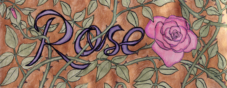
This is the piece that was in progress last Monday when I took the photo of my workspace.
It’s shiny!
I bought some pearlescent watercolors in my last batch of art supplies, and this was the piece I tried them out on. They’re quite nice to work with, and nicely shiny, which is always a plus. I’m not entirely fond of how the background color meshes with the rest of the piece (it’s a tad too bold compared to the more delicate colors on the rose plant and flowers), but well, such is life. It was one of my experimental pieces, after all. And I am quite pleased with how the rest of the shiny stuff came out, since it meshed quite nicely with the non-shiny stuff.
I’m also pleased you can actually tell it’s shiny in the scan. Now it’s not perfect. After all, the angle of the shine won’t change as you move it like the original does, and some parts don’t really look that shiny purely because they didn’t catch the scanner light right. You can tell that the piece isn’t perfectly flat, and that a crease got in there in the lower left corner. (Said creases are irritatingly easy to do when this paper has large wet patches – common when doing the background. All it takes is a slight push in the wrong spot and bam, crease.) But I was fearing that the shininess wouldn’t come through at all.
Actually, just about all of my watercolor pieces don’t come through quite right. It’s not that the scanner is scanning it wrong. My scanner works awesomely, especially for a decade-old scanner I bought at a garage sale for $10. It’s just that the way monitors display light can’t handle the colors right. Most screens display color using an optical trick. If you’ve ever looked at a printed color image really really closely (hasn’t everyone?), you’ll notice that the flat areas aren’t flat, they’re full of little dots. (If you don’t spot this, try again with something printed with lower quality. Higher quality printing has the dots too close to easily see.) No printer can afford to have a specially mixed ink for every single color on the page, not unless they’re printing that exact color over and over again in large quantities (like in assembly lines). There’s just too many colors out there. So they cheat using halftones. They only have three ink colors, cyan, magenta, yellow, and black, which are the primary colors of light, known as subtractive color. White light is actually an amalgam of all the colors, just looking white because the combination evens out and is bright enough to appear as white rather than anything else. We see color by subtracting out other colors (an apple is red only because its molecules absorb every wavelength of light but red, and the like), so using the subtractive color set, also known as CMYK, makes sense for printing. That’s why most people’s printers only require three colors of ink, and two cartridges. You can get just about any color from just printing little dots of the colors over top of each other in a way that combines to look like the color you want. (Not that this stops me from drooling over printers that use a larger number of inks, and can get even better color fidelity.)
Now, computer monitors and TV screens don’t use CMYK, but they do use the same trick. Every pixel on your screen is actually three sub-pixels, one red, one green, and one blue. They fire in different strengths depending on what color is desired, for instance the red one fires strongly and the green one lightly if you want an orange color. This RGB palate is known as additive color, since you’re adding colors together to make white. Which, just like CMYK making sense for things you see under white light, makes sense for things seen on a glowing screen. Instead of taking away pieces of the light wavelength you’re already seeing, the screens are creating light already missing wavelengths, to show you a certain color.
The trick comes in choosing which specific shades of the colors to mix. The standard RPG palette used in just about all screens is lacking wide swaths of possible colors. You can’t get a green that’s greener than the one chosen by mixing in blue or red, after all. And they couldn’t just choose the widest array of possible colors, since the colors we humans see is not evenly distributed between all parts of the color wheel. We see far more variations of green and blue than of all the other colors combined (go to that link on standard RGB above to see the swaths we cut out). So, you think, a bunch of really smart people sat down and decided which red, green, and blue to use, based on the needs of the people using it compared to cost? Right?
Well, sort of. It was more a case of lowest common denominator winning out. The people who proposed the sRBG (Hewlett Packard and Microsoft, not exactly the most unbiased group) were tired of adding in code and hardware to handle every single color profile used by all the monitors out there, which at the time was a rather motley bunch. Something produced on one screen would probably not show up correctly on a different screen, just because that screen used a different base green color or the like. So consumers weren’t too happy about it either. The color palette that HP and MS proposed (which is now sRBG) was based around the cheapest and most common monitors out there: CRT monitors. You know, those old huge monitors you used to use (or see in old shows), that were a pain to lift. The one you dumped when flat screens became cheap enough back in the early 2000’s? Yeah, those. The standard was set back in the 90’s. And modern LCD screens can actually display a wider range of color than CRT can. So we’re unnecessarily missing a wide range of colors on our display these days. But standards do have their advantages. They mean artists don’t have to delve deep into color management to set their pieces to say “display like this” to all those maverick monitors, which is a good thing. What you see on your monitor will look just about the same on a different monitor.
But it does mean that a lot of the delicate color variation I like doing in the green-blue spectrum for my paintings doesn’t scan right. I’ve got a paint labeled “indigo” which, rather than being purely between blue and purple (its inclusion in the colors of the rainbow is because Newton said it was. Really), also carries some strong green tones. (It is Chinese paint, they do have a different culture of color, so Indigo is probably the closest translation into the colors we westerners use) Those green tones don’t come through properly when it is scanned, turning my delicate green-blue seas into, well, plain blue seas. It’s a bit irritating, but at least it means that anyone buying any originals I sell will actually have something no one else does, even if I also sell prints of the picture. Add in the shiny paints I’ve got, and there will be quite a noticeable difference, really. It’ll be shiny, after all!


