I didn’t pet the sheeeeeeeep, but I think doing so was allowed…

Photo #636: SheeeeeeepLocation Taken: Maryland Sheep and Wool Festival
Time Taken: May 2011

Sheeeeeeeeep.

Fluffy sheeeeeeeeeep.

…That’s probably a non-standard wool on that there sheeeeeep. These sheeeep were at the Sheep and Wool Festival, and kept in a tiny pen next to a place selling yarn and roving and the like. There were a few of that sort of pens around, and many of them seemed to be of unusual varieties of beasties. That and look at the curls on that there sheeeeeeeeeep. Most sheeeeep don’t have those.

…I think it wants some food. Either that or is highly curious about being around far more humans than normal.


Pareidolia fills the world with new friends!

Photo #635: Rock FriendLocation Taken: Arcadia, Michigan
Time Taken: January 2011

Isn’t this such an inquisitive little rock-creature? Cute, too.

Don’t you love how just the suggestion of a face and a very vaguely humanoid shape is enough to give something a personality?

Ooooo, if you look at the shadows on its head, it vaguely looks like a smile! It’s a friendly rock-thing!


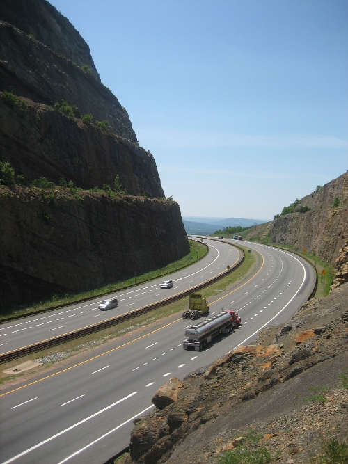
Miniature Mountain

Photo #634: Miniature MountainLocation Taken: Sideling Hill, Maryland
Time Taken: June 2007

Oh my. I’m trying out a new program called f.lux that shifts the color of your computer screen heavily toward the warm and dim side of the light spectrum at night, to make using the computer easier on your circadian rhythm. (Not that I have a circadian rhythm. I’ve got more of a circadian randomly-screaming-two-year-old.) So far it’s nice and gentler on the eyes than even my already dimmed-and-warmed settings, so I do recommend the program. It even has a one-click button for turning it off when you need to do color-sensitive things like make art.

Which I don’t really need when I’m looking at photos, at least. The only time I manipulate the color balance on my photos is for the ones I took while in the wrong color setting on my camera, and that’s a pain, so I don’t even do that often.

But the extra tilt towards the reds and browns does make this particular image look even more like it’s of a miniature diorama rather than a full sized mountain. Seriously, every time I look at this photo, those car and trucks look like toys. And that marvelous cut through the mountain, so impressive in real life, looks like expertly-painted foam and wood.

I’m not entirely certain what’s causing it. Though I do detect some hints of a natural Tilt-shift effect. That’s where you add extra blurring to a photograph to make it look like it was taken using a close-up focal range. (Close focal ranges fall off into blurriness rather quickly when you move away from the focal plane, while long ranges barely fall off at all.) The foreground is out of focus, and the background falls away right where you’d expect the blurriness to pick up again.

There’s also the general simplicity of the scene, well within the range of what can be made by an expert model maker. Heck, even amateurs could probably put this together, assuming they had good enough painting skills to make the rocks look right.

But still, it’s a fun illusion. I spotted it days ago, but once I saw the effect of just a bit of a color shift, I knew I had to mention it.


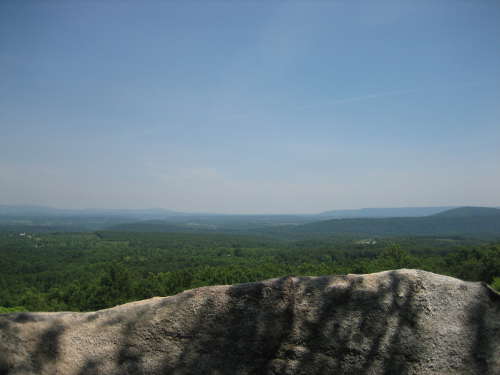
The Rock Looks Like a Ridge! That’s why I took the photo…

Photo #633: Rock RidgeLocation Taken: Sideling Hill, Maryland
Time Taken: June 2007

You know, when I look back on some of my older photos, I can actually see how much of a novice I was.

Not that I can easily describe how I do that, mind you.

It’s something to do with choice of composition and lighting. And, most importantly, lack of a true focal point. The best images have edges and lines hidden within them that draw the eye around in certain patterns. This implied motion actually adds a lot of dynamics to a piece of art, giving just a bit of life to a still image.

Focal points are one of the key aspects of this type of movement. These are spots where multiple composition lines converge. This, of course, means you want something important at that point, one of the key elements of whatever idea or concept you’re trying to get across, from the saucy expression of an eye on a drawing of a handsome pirate to a compass resting on a map in an image of an explorer’s desk.

This piece, alas, has no true focal point. The composition lines all run largely parallel to one another, going along the edges of the ridgelines. There’s also secondary lines of eye motion going perpendicular to the primary lines, which is what you follow as you hop from one ridge to the next as you figure out the perspective of the piece. The shadows on the rock in front actually don’t add any extra lines, believe it or not. They actually detract from the piece, making the rock in front less interesting than it would be in full sunlight.

All these parallel lines mean that your eye either runs off the page or sits still due to lack of interesting things to move to. It’s a good photo of the low ridges of the Appalachians, with bonus rock in front. But it is not a dynamic photo.

The easiest way to fix it, of course, would be to add more lines in other directions. Get some sort of corner in there, and you’ve got an instant focus point. Perhaps not an interesting one, but still, a focus points. And there are no lines at all in all that clear blue sky. What wisps of clouds are there aren’t strong enough to catch the eye. A cloudier day would be better, and a different time of day. These days I don’t even bother taking photos at high noon, not unless there’s something extraordinary. Light coming down from above makes the piece boring.

Perhaps that’s how you can get better as a photographer. Just take thousands of photos, thinking about composition and lighting and the like with every single one. Eventually it’ll sink in, and your pieces will be much better. Well, at least in average. Probability says everyone takes poor photos now and then. At least that also means even novices take amazing photos on occasion.


Now the question is, did he set the fire? (Hint: yes)

Photo #632: Burning LighthouseTime Drawn: June 2012

Wow, has it really been a year and a half since I made this? It’s one of the most recent pieces I’ve made using my watercolors, after all. Well, not counting the pile of half-finished works, that is.

…I suppose I should clean off my workspace at some point so I could work on those again. It’s always tough when you’re trying to fit more stuff into a room than you have storage for. Leads to, well, giant piles on top of your desk.

Although, there’s still the problem of my not having a functional scanner, so I can’t show any pieces I make off anyway. Well, technically the scanner functions, but it’s so old they stopped releasing drivers for it a while back, and the old ones don’t work in 64-bit operating systems like Windows 8.

(Yes, I’m using Windows 8. Yes, I know it has a poor reputation. My computer died right after it came out, and I was able to buy it on a very steep discount thanks to their “Please swap to the new OS, pleeeeaaase?” sale. Certainly cheaper than Windows 7 or XP, if I could even find those for sale. It’s very good on the technical side and very poor on the user interface side, but I’ve wrangled it around to a form I can work with. And it boots up in less than a minute, which I love.)

I haven’t talked about the artwork yet. Silly Sharayah, going off on tangents all the time. Double tangents, even.

This piece was really just a random doodle I drew to test out some coloring techniques. You see the soft gradient on this random guy’s hair? That was made by painting with clear water right next to a still-wet section of watercolor. The color bleeds into the water, forming that interesting gradient.

…Huh, I’d forgotten I’d given him cross earrings. No, there wasn’t any symbolism in that, though I’m sure you can find some if you analyze the piece enough. Symbolism’s like that.

And the burning lighthouse is just because I like doing something odd in the background to mess with the viewer. I also haven’t really figured out how to draw fire. You may have noticed. Next time I need to draw a burning lighthouse, I’ll have to burn one down- I mean, use reference photos.