Greens and Blues and Pinks and Purples and Whites and…

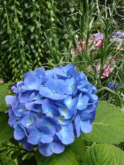
Photo #413: Brilliant ColorsLocation Taken: Garfield Park Conservatory, Chicago, Illinois
Time Taken: April 2008

I’ve got a small addiction to highly saturated colors in my art. Which is odd, since I actually prefer more muted colors in other people’s art. But when it comes time for me to color away, I always reach for the powerful colors first. At least my preferred mediums let me go back in and tone the colors down in one way or another so it gets closer to what I actually wanted.

Still, when I run across a photo with deep colors, like the brilliant greens and blues and pinks of this one, it just makes some part of me squeal in glee at the colors.

It’s always odd to have just one small part of you be ecstatic, while the rest is far more ambivalent. Leads to an odd disconnect.

At least in this case the photo itself is pretty enough that the parts of me that prefer the gentler colors can still appreciate it.

  

I’d like these metal flowers better if they weren’t so uniformly grey…

Photo #412: Millenium FrameLocation Taken: Chicago, Illinois
Time Taken: April 2008

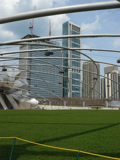
There’s a certain modern style of architecture that believes in making anywhere where acoustics matter look somewhat like a giant metal flower. I know it’s got all sorts of benefits, and certain examples of it come out looking decent, but most of them just look like a lump of shiny grey petals littering the ground.

The big music pavilion in Millennium Park in the heart of Chicago is no exception.

But it does have one element I like.

One of the challenges for designing a space to hold a very large amount of people is how to properly distribute lights and speakers so that every spot in the crowd is covered well. Here, they did a nifty criss-cross of curving beams across the whole grassy field, and hung the lights and speakers on that. What it does is divide up the view into these rhomboid shapes that actually help draw the eye towards contemplating the scenery and appreciating it.

It’s called the framing effect, where setting an area (or picture, or view) apart using basic shapes in a non-assertive fashion makes that area more interesting. It’s why paintings have frames, comic strips have panels, and why I put the little lines around all my photos. It’s one of those odd psychological tricks, where just adding something to say “this is set apart and thus special” actually makes people think it looks at least twice as appealing as if it were unframed.

Which sometimes really irks the artist in me, you know. If just putting a black line around something doubles its appeal, does that mean all that effort I put into making that item could have gone into just making two black lines? I know it doesn’t really work that way, but still…


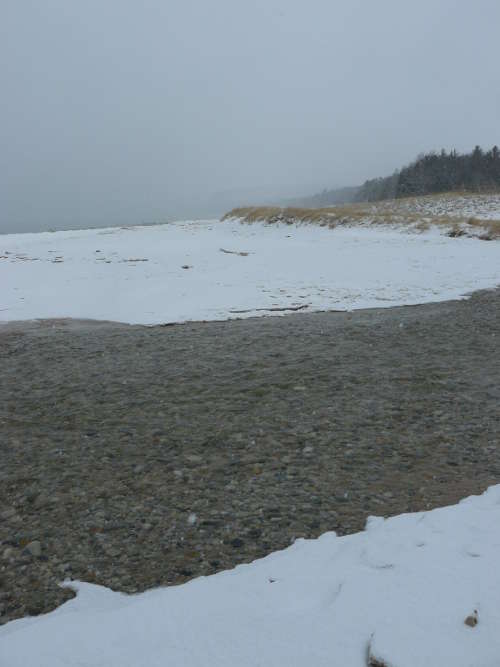
A Winter Stream, or well, Creek I guess. The difference is academic, really.

Photo #411: Winter CreekLocation Taken: Arcadia, Michigan
Time Taken: January 2011

I’m not really a classic beach person. I like swimming and all, but sand is a bit irritating, salt water tastes bad, summer temperatures are annoying, and don’t get me started on the whole “laying in the sun to tan” thing. Fresh water beaches are better, like this one along Lake Michigan. At least there the water is decent, and the sun is less common than in most classic beaches in, say, Florida. And it’s really pretty in winter, too.

But there’s one thing that I love seeing no matter what beach I’m at. The interesting patterns in the sand as a river reaches the sand. I love swimming in those places too, since the water is fresh and frequently warmer than the sea.

Which is why there’s a flow of water for this creek even in the heart of winter, even for a shallow spot like this. There’s enough water flowing through that ice doesn’t accumulate, just washes out to sea, and the comparative warmth keeps even the shallow spots flowing.

I wouldn’t suggest swimming in it, though. It’s only comparatively warmer, after all.


When looking at your old work, try to remember to not cringe too loudly.

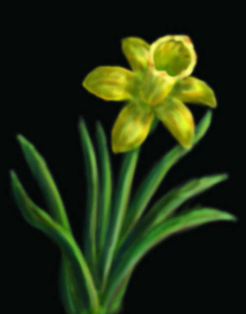
Photo #410: Newbie DaffodilTime Drawn: June 2009

Has it really been nearly four years since I bought my Wacom Bamboo tablet? Even just glancing at that site I can see they’ve done some major redesigns since then. But my little tablet keeps going strong.

I’d really prefer something more along the lines of what most people think of when they hear “tablet” today. Aka an iPad style thingamabobber, with a touch screen and all that. My tablet doesn’t have a screen. It’s just a fancy input device with a large drawing surface and a specialized pen-stylus to tell how much pressure you’re applying to the surface. You still have to look at your computer monitor to see what you’re drawing. So while it’s much better than trying to draw with a mouse, I’d still prefer to draw on a screen. But iPad-style tablets don’t really support styluses that well, much less pressure-sensitive ones.

So for now, I’m living with the disconnect that drawing on one surface and looking at another for the results brings. It’s somewhat like trying to draw something by looking at the reflection of the paper in a mirror, now that I think about it. It’s possible, but it takes a lot of getting used to it to do well.

So that’s where this daffodil came from. This was my first attempt to get used to the tablet.

It’s blurry, but that’s how I drew it, since I used only one brush pattern and it was a blurry one. The colors are a bit odd, but I hadn’t a clue how to properly shade and shift colors with the tablet. And it’s not fully accurate, because I wasn’t used to having a reference up while I drew.

Still, for all those newbie mistakes, it’s recognizably a daffodil. So there’s at least that.


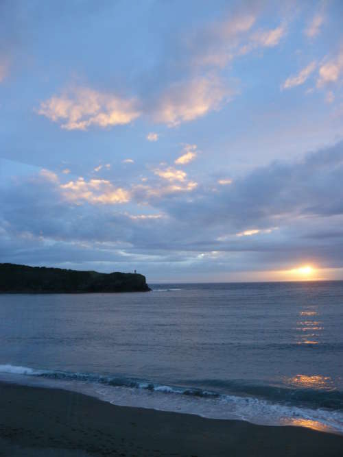
The Sweet Slow Sunsets of Summer

Photo #409: Slow SunsetLocation Taken: Trout River, Newfoundland
Time Taken: July 2012

During the heart of the summer, up in the far northern lands, the sunsets get long.  The sun just ambles over to the horizon, taking its own sweet time.

Which, of course, means lots of time to get the perfect sunset photos.  Especially the ones with just the right mix of coloration on the clouds.  In more equatorial areas, that would require taking the photo in the exact right minute.  Here, though, you’ve got time to consider angles and composition.

It’s really quite pleasant.